You can pick between two themes — light and dark — or let customers pick which one they’d like to use.
Light theme
The light theme features a light background with dark text. The logo you use should likely also have black or dark text.
Some advantages to using light mode are:
- Creates a lighter, brighter and more airy feel that may match your brand or products or services better.
- Can sometimes be easier to read under brighter lights such as when indoors.
- Has good contrast that makes easy to read (the “black” text you see on qReveal is actually a very dark gray, which has been shown to reduce eye strain). It’s the kind of thing that you don’t really notice but can go a long way in making things easier to read.
- Photography can stand out well.
- If you use the light theme as default or let your customers switch between both modes, we recommended uploading to viewers of your logo as outlined here.
Dark theme
On the other hand, dark mode switches the background to a dark background with text becoming lighter.
The advantages to using this option are:
- Can be ideal for brands who want to give customers a richer, more elegant experience.
- For dining in low light (indoors or outdoors), the dark theme can reduce the sometimes harsh effect that white or light screen designs have on people’s eyes.
- Likewise, using a darker mode can reduce the amount of bright screens across your business, particularly in lower light, which can sometimes be distracting or harsh to look at.
- The dark theme still has good contrast and is easy to read. On qReveal, the “black” background is really a dark gray to reduce eye strain.
- Photography still looks great although some photos may appear more “blended” into the background — which could be your desired affect.
Theme settings
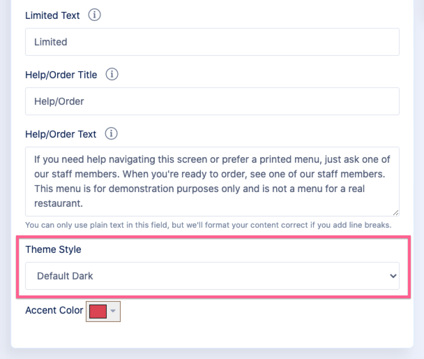
In qReveal there are four options for themes (to edit this setting, click Settings on admin navigation).

- Default light: This defaults all visitors to seeing the light version but lets them click the menu “hamburger” icon in the upper right and toggle between dark and light. An anonymous cookie is used to remember the user’s selection.
- Default dark: Likewise, this defaults all visitors to see the dark version. They can switch between both themes using the menu.
- Only light: Only lets users use the light theme. There is no option to toggle between the two.
- Only dark: Only lets users use the dark theme. There is no option to toggle between the two.
In most cases, we recommend picking one of the default options to give your customers the ability to set their own preferences, but this is entirely up to you.
